Branding / Design
Logo Redesign:
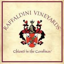
The Challenge: Our existing logo used curved text that created legibility issues at smaller sizes and formatting within traditional square spaces.
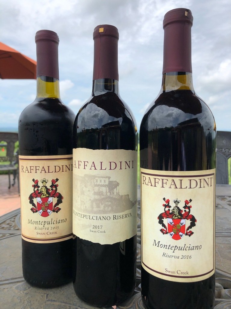
The Solution: I redesigned our logo to incorporate all the necessary elements, adopting a more square shape to allow the company name to stand front-and-center. Customers identified with the experience, so we used the Villa in lieu of the family crest to help cement their happy memories.
New Wine Label:
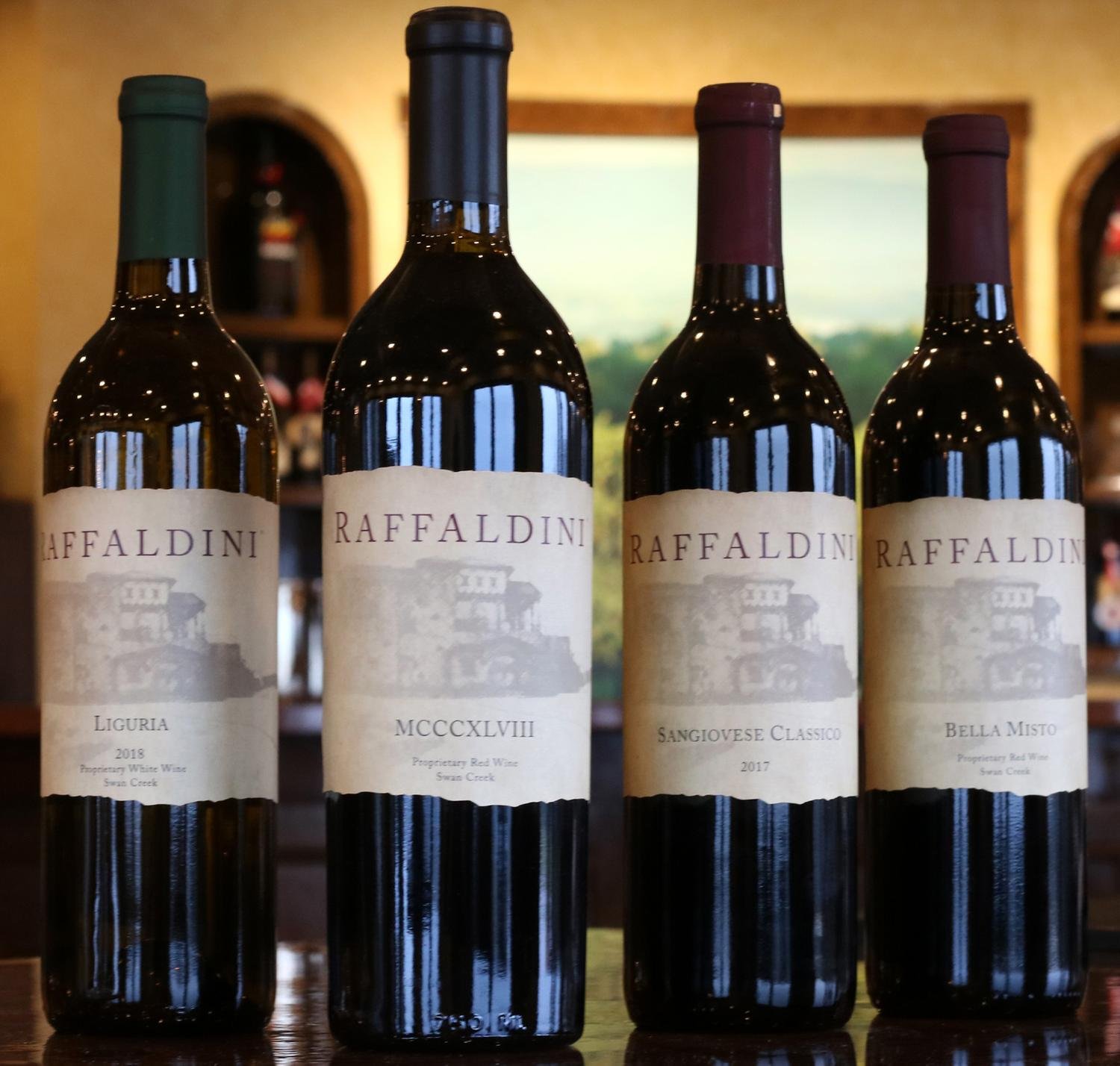
The Challenge: Our packaging needed a refresh.
The Solution: I redesigned our label to be a one-piece wrap, more cost effective than an alternating front and back, as well as incorporating the iconic image of Villa Raffaldini and a die cut that mimics the mountain skyline overlooking the vineyards, cutting a distinctive silhouette.


